Thursday, September 12, 2024
Overview
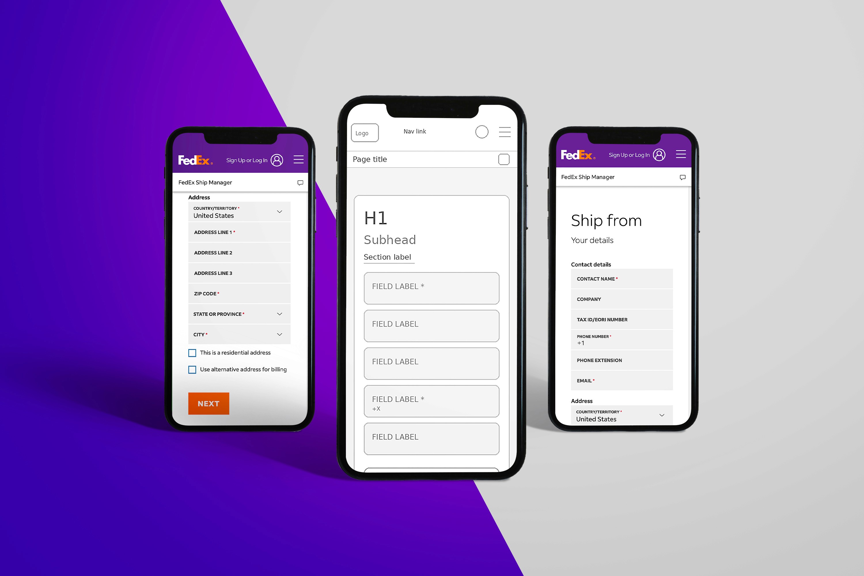
This page’s job is simple on paper: help customers estimate shipping cost and delivery options based on details like origin, destination, ship date, packaging, weight, and dimensions—and do it fast.
Role: Senior UI/UX Designer
Scope: Page UX, form flow, information hierarchy, responsive behavior, accessibility, interaction states
The Problem
Even motivated users can hit friction on a rate calculator—because the task is detail-heavy and time-sensitive.
Too many inputs feel “expensive” up front. Users often don’t have every detail ready (dimensions, declared value, etc.).
Unclear sequencing. When fields aren’t grouped by how people think (“Where is it going?” → “What is it?” → “When?”), users hesitate or abandon.
Decision overload at results time. Rates and delivery times can produce multiple options; without strong hierarchy, it becomes a comparison problem instead of a decision.
Mobile input pain. Zip codes, dates, and package measurements are easy to mistype on mobile, and error handling can feel punishing.
The Solution
I redesigned the experience around progressive disclosure and decision-ready results—so users can get a quote quickly, then refine only if needed.
1) Intent-first structure (scanable in 3 seconds)
The form is organized into plain-language sections that match user intent:
From / To (origin + destination)
Package (weight first, dimensions optional until needed)
Timing (ship date + delivery options)
This aligns directly to the core inputs FedEx requires for accurate estimates.
2) “Minimum viable quote” first, refinements second
To reduce drop-off, the primary path collects only what’s needed to show an estimate:
Origin + destination ZIPs
Packaging type
Weight
Then we progressively reveal: dimensions, value/insurance, and special handling—only when relevant.
3) Results designed for decisions, not reading
The results area emphasizes:
Best overall choice (balanced cost + speed)
Fastest and Lowest cost anchors
Clear delivery-time language and constraints
This turns the output into a quick selection instead of a dense comparison table.
4) Error prevention that feels helpful
Inline validation (ZIP format, required fields)
Smart defaults (common packaging, remembered preferences for returning users)
Clear, human error messages and “fix it” links near the problem field
5) Mobile-first input ergonomics
Numeric keyboards for ZIP/weight
Date picker tuned for speed (next available ship date)
Sticky “Get rates” CTA once minimum inputs are complete
Outcome (What improved)
The redesigned page makes it easier for first-time and returning shippers to:
understand what’s required,
get an estimate with fewer steps, and
choose a service level confidently.
Category:
UI/UX
Client:
FedEx
Duration:
2 years
Location:
Memphis, TN (Remote)