Monday, August 15, 2022
Role: Senior UI/UX Designer
Platform: Lowes.com (Mobile Web)
Type: UX audit + redesign direction
Focus: Findability / Product confidence / Faster checkout
Overview
Lowe’s mobile site supports high-intent shopping in real-world contexts (in-store aisles, on a job site, mid-project). This concept redesign streamlines the mobile journey from Find → Decide → Get It by improving navigation, search, PDP hierarchy, and fulfillment clarity.
The Problem
Mobile shoppers need quick wins, but the experience can feel heavy when:
Product discovery takes too many steps (search ↔ categories ↔ filters ↔ results backtracking)
Promos compete with primary actions (search + department entry points get buried)
PDPs require too much scrolling to find fulfillment, key specs, and decision drivers
Checkout friction stacks up (fulfillment confusion, long forms, sign-in interruptions)
The Solution
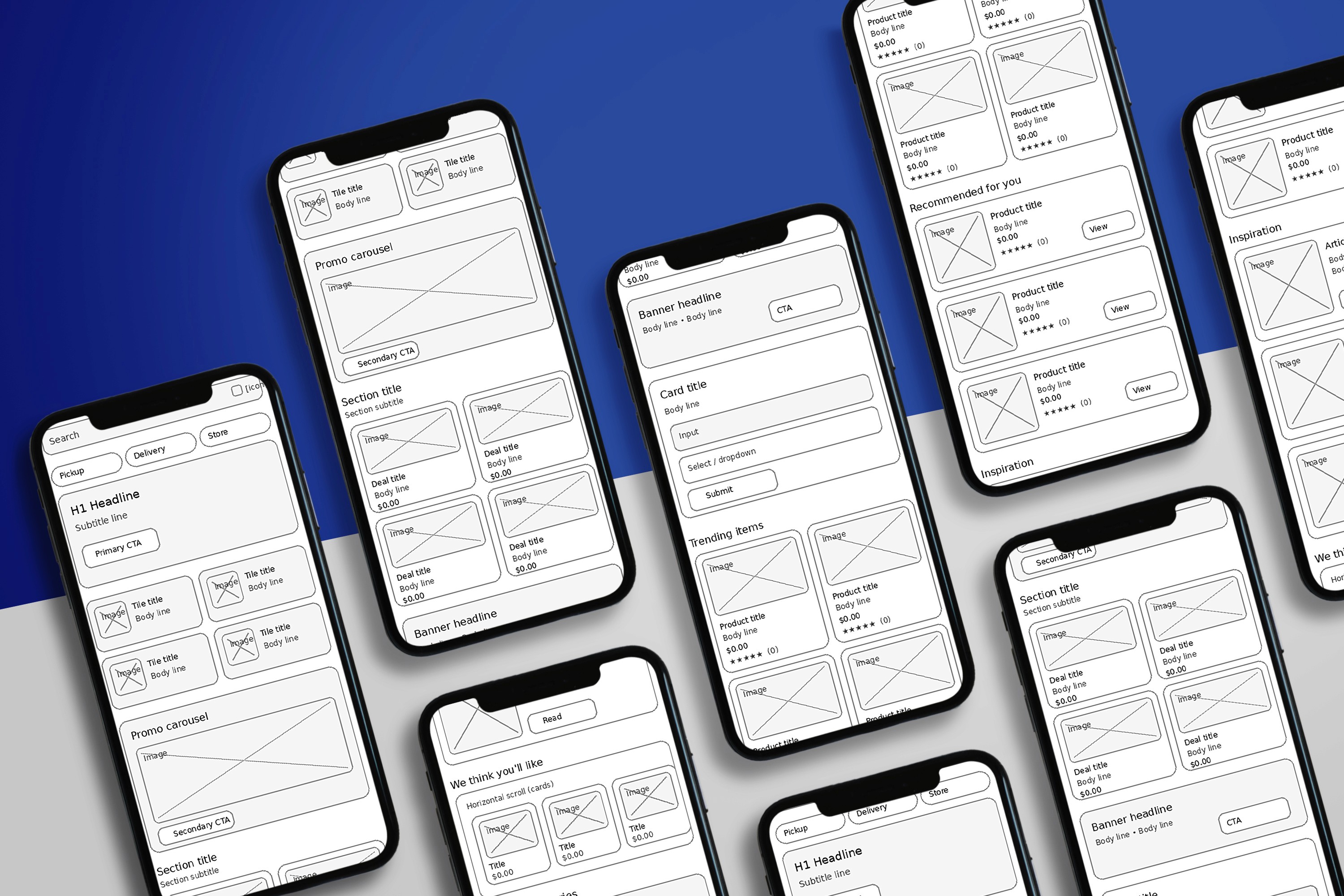
I designed a mobile-first UX system centered on speed, clarity, and confidence:
1) Search-First Entry
Persistent search designed for high-intent behavior
Quick actions: Shop by Department, Reorder, Track Order, Nearby Store
Recent searches + continue shopping patterns
2) Lightweight Department Navigation
Scannable department grid with progressive disclosure
Clear breadcrumbs and “return to results” orientation
3) Faster PLP (Product Listings)
Sticky refine bar: Sort • Filters • Pickup/Delivery
Applied filter chips to reduce confusion
Stronger product cards: price, rating, availability, key decision info
4) PDP Built for Confidence
Above-the-fold: price, rating, promo, fulfillment, store availability
Key specs snapshot before long content
Sticky Add to Cart with fulfillment summary
5) Checkout with Fulfillment Clarity
Items grouped by fulfillment type (pickup today vs ship later vs delivery scheduling)
Transparent fees + cleaner edit controls
Autofill-friendly forms and fewer interruptions
Screens (Suggested Visual Order + Captions)
Use these as image captions under each mockup/wireframe.
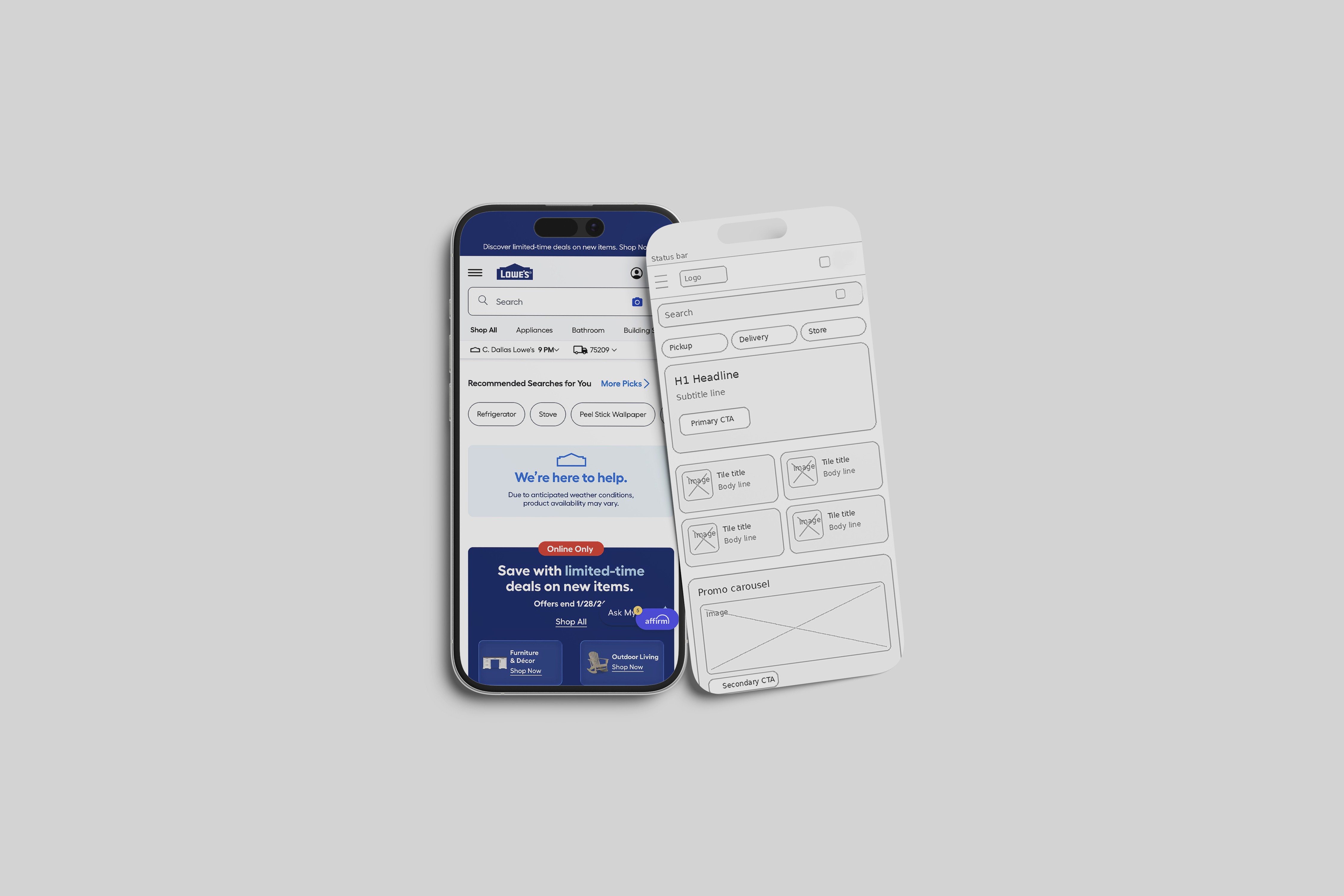
Homepage / Entry
“Search-first layout with quick actions and faster entry into departments.”
Department Navigation
“Scannable departments with progressive disclosure to reduce overwhelm on mobile.”
PLP (Results + Filters)
“Sticky refine bar + filter chips make refining fast and reversible.”
PDP (Product Detail)
“Decision drivers placed above the fold: fulfillment, availability, key specs, and CTA.”
Cart / Checkout
“Fulfillment grouping and streamlined forms reduce surprises and abandonment.”
Impact (What This Design Is Built to Improve)
Higher search success and faster time-to-product
Improved PLP → PDP engagement through clearer refinement and product cards
Increased Add-to-Cart rate with stronger PDP hierarchy
Reduced checkout abandonment via fulfillment clarity and simplified inputs
My Contribution
UX audit and problem framing
Mobile IA and interaction patterns
Component strategy (search header, filter sheets, sticky CTAs, fulfillment modules)
Screen-level UX/UI direction for homepage, PLP, PDP, and checkout
Category:
UI/UX
Client:
Lowes
Duration:
1 year
Location:
Dallas, TX (Remote)